central perspective
In this page I apply the circle of view framework to create the simplest type of perspective drawing, based on one point perspective (1PP) or central perspective. Central perspective is governed by a single vanishing point: its fundamental visual characteristic is recession in depth or perspective convergence.
This page addresses three general topics. The first is the mechanical task of mapping objects from physical space onto the image plane — actually using the 90° circle of view framework to make a picture. I explain a refinement known as the visual ray method that makes it simple to find vanishing points and to build perspective forms from drawings or measurements placed along the ground line. Then I introduce central perspective in terms of the 90° circle of view framework, and in particular the use of orthogonals and diagonal vanishing lines to define unit dimensions of width or perspective depth.
The second general topic is the artist's control of this powerful depth illusion. I explain the triangular geometry that governs the distance & size relationships between object size, object distance, drawing size and viewing distance; the procedures for scaling the drawing that control the size and arrangement of objects in perspective space; and the overall effect of display geometry on the image impact. These topics are conventionally obscured by cookbook perspective construction techniques, but they offer many creative resources for the design of compelling images.
The last general topic is the practical, step by step method necessary to construct a perspective image. I describe the early Renaissance methods, outlined by Alberti in 1435 and used by most 15th century painters, as a point of contrast with the modern approach.
I've written this page to emphasize the artistic decisions that shape the geometrical construction of a perspective image. Take the time to master the concepts and methods on this page, and all other perspective topics will come easily. (All the terms used in this page are defined in the perspective glossary.)
Before we start: why it is customary to illustrate perspective constructions with those boring rectangular solids? First, all edges are straight lines and all corners contain 90° angles, so the forms are easy to visualize from any point of view. Second, cubes illustrate the basic perspective strategy of plotting only the significant points: we only need eight corner points to create the whole form. Third, cubes and rectangles represent the basic volumes of buildings and architectural spaces, which traditionally have been the main application of linear perspective. Last, a square grid or "cage" provides the framework for the perspective projection of very complex curves or three dimensional objects, as we'll explore in a later section.
the visual ray method
The 90° circle of view framework and the basic rules of perspective provide the mechanism for creating perspective images of any real object on an image plane. Now, we put it to use.
The challenge is to define an object geometry in perspective space: locate it in relation to the direction of view, scale it to the appropriate size, and find the vanishing points for lines that define its edges. The solution is called the visual ray method of perspective construction. This was repeatedly suggested in the 17th century, but was first systematically applied to perspective problems in 1715 by the English mathematician Brook Taylor. Once mastered it is an elegant and powerful way to solve any perspective problem.
technique |
|
orthogonals & central recession |
The Double Fold. The visual ray method requires a radical transformation in the basic perspective geometry: a "double fold" around the image plane (diagram, right).
• the viewpoint in front of the circle of view is folded upward along the horizon line — just as we'd fold up the tailgate on a truck — until it is lying in the image plane above the horizon line.
• the ground plane behind the circle of view is folded downward along the ground line — just as we'd bring down a garage door — until it is lying in the image plane below the ground line.
In this flattened position we see the viewpoint and ground plane from below (as if lying on our back looking upwards) at the same time that we are looking through the circle of view from the original viewpoint. This means the horizon line also represents the image plane seen edge on (from below).
Because the viewing distance is equal to the radius of the 90° circle of view, the viewpoint lies at the intersection of the circle of view with the median line: it is directly above the principal point. At the same time, the ground plane extends from the ground line. Three different planes — the viewing plane, the image plane and the ground plane — are one.
The ground plane and viewpoint keep the same relationship to each other — centered on the median line — which preserves the triangular proportions between the object, image area and viewpoint. As a result, we can use a compass, ruler and pencil to construct all the perspective relationships, because they all lie in a single plane.
The folds have a specific significance: the ground line is the intersection of the ground plane with the image plane, and the horizon line is the vanishing line for the ground plane. According to perspective rule 11, planes are always bounded by these two lines in the perspective image, and the two lines are always parallel. The visual ray procedure will work in any situation, even when the planes are tilted to the horizon line, provided the folds are made on the intersection and vanishing lines of the plane that is to be scaled, and the viewpoint is folded in relation to the vanishing line.
Visual Rays and Perspective Depth. First, let's validate this new setup by repeating the perspective problem introduced at the beginning: constructing the perspective image of a metric grid. This is done in two parts:
(1) The horizontal spacing of the orthogonals of the grid is found from the intersection of the orthogonals with the ground line; the intersections are projected into the perspective image by connecting them with their vanishing point (the principal point, vp).
(2) The vertical spacing of the transversals of the image grid is found by drawing a visual ray from the grid point in the ground plane to the viewpoint; the transversal is at the intersection of this visual ray with the orthogonal of the grid line in which the point lies.
Thus, two lines are necessary to locate an image point: (1) a visual ray from the physical point to the viewpoint, and, in central perspective, (2) an orthogonal from the ground line to the orthogonal vanishing point (which is the principal point in central perspective).
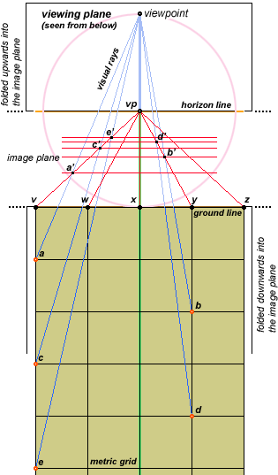
finding transversals with the visual ray method
In the diagram, the points a through e mark intersections in the metric grid on the ground plane. Points a, c and e line on the orthogonal that intersects the ground line at v; points b and d lie on the orthogonal that intersects the ground line at y.
The first step is to connect the ground line intersections (v to z) with the orthogonal vanishing point (vp), to create five orthogonals in the perspective image.
The second step is to connect each point by a visual ray (blue lines) to the viewpoint.
Each visual ray intersects its corresponding orthogonal at the image of the grid intersection in the image plane: this defines points a' to e'. Horizontal lines through these points define the transversals, or the metric grid units of perspective recession. (Compare this diagram with the earlier diagram based on the elevation and plan.)
Why does this method work? I won't give the geometrical proof, but the diagram (below) demonstrates the geometrical basis in equivalent elevation or plan views.
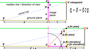
why the visual ray method works
(top) the standard perspective setup, where diagram represents both an elevation and a plan view; (bottom) the visual ray setup, showing separate locations of the image point (ip) and principal point (p) when diagram is viewed as an elevation or a plan
In the original setup for the perspective image, the visual ray from the physical grid point g to the viewpoint intersects the image plane at the image point (ip). This is located some distance b below the principal point p (in the elevation) or shifted to one side of the median line (in the plan). The image point ip defines a matching distance a above the ground line G (in elevation) or toward the median line from intersection of the orthogonal with the ground line (in plan).
Thanks to the triangular proportions (explained below), the image distances a and b are in the same proportion as the physical distances from the physical point to the ground line (X) and from the viewpoint to the image plane (Y). Therefore: a/b = X/Y. As a result, we can add the corresponding physical and image distances (X+a and Y+b) and end up with the same proportional location of ip on the visual ray (blue line). This means ip can be found as before, at the intersection of the visual ray with the image orthogonal drawn from the ground line intersection to the principal point (red line in plan).
Visual Rays and Vanishing Points. The next application of the visual ray method permits the artist to find the vanishing point for any line in physical space.
To locate the vanishing point(s), we require a plan of the primary form. Recall that a plan is the view straight down on the ground plane, which shows the location, length and angles between walls or sides of the form (for example, the floor plan of a house). The primary form is the object we want to draw in perspective — a skyscraper, a house, a table, a chair — or a single representative form that defines the perspective orientation of many other forms, such as a single tile in a square tiled floor. (A square plan is ideal, as it defines the diagonal vanishing points as well.) Then we proceed in three steps:
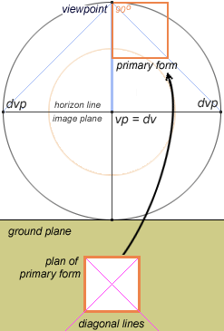
plan of primary form located at the viewpoint
the method used to find vanishing points on horizon line; primary form in the orientation for central perspective
1. Turn the plan to the same angle to the direction of view as the actual object. In central perspective, the four sides of a cube are either parallel or perpendicular to the image plane (ground line). So we rotate the square plan (orange) in the visual ray setup so that its sides are either parallel or perpendicular to the ground line and horizon line.
2. Align one side exactly with the viewpoint. Because all visual rays must pass through the viewpoint, we can define a visual ray with any plan line that is placed on the viewpoint.
3. Extend the plan line on the viewpoint to the vanishing line of the plane that contains the plan. For objects on the ground plane, this is the horizon line. This intersection defines the vanishing point for the plan line and all lines parallel to it in the image.
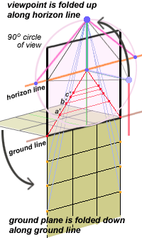
folding the ground plane and viewpoint into the image plane
This procedure works because any visual ray parallel to a line intersects the line's vanishing point (rule 5), and this point, because the line is parallel to the ground plane, must lie in the vanishing line for the ground plane (the horizon line, rule 14).
The central perspective diagonal vanishing point (dvp) is found by extending a line from the viewpoint through the diagonal corner, and symmetrically on the other side. As shown above, the vanishing point is at the principal point (direction of view), and the diagonal vanishing points are at the intersection of the 90° circle of view with the horizon line.
In most situations it is necessary to work with a much reduced plan in order to manipulate it conveniently on the perspective layout. But so long as the plan is turned so that its sides have exactly the same angle to the direction of view as the original object, and is large enough to produce an accurate extended line to the horizon line, then its size does not matter. Indeed, if convenient, we can simply use a protractor, centered on the viewpoint, to measure the visual angle that matches the angle of the plan side to the direction of view.
Visual Rays and the "Principal Foundation". The mention of a "much reduced" plan brings us to a key practical problem. What if the form we want to draw is a considerable distance away from the viewpoint? Do we need a ground plan 100 meters long to work out the perspective image of an object 100 meters away?
The solution to this problem involves several steps, but it starts with Taylor's "principal foundation of the practice of perspective" — the fact that any image line that is not parallel to the image plane must end in an intersection with the image plane and in a vanishing point (rule 4):
1. The intersection with the image plane of any line contained in the ground plane is a point on the ground line.
2. A line of sight parallel to the line in the ground plan intersects the image plane at the vanishing point for both lines (rule 5).
3. Because the lines are parallel, their vanishing point is on the vanishing line of the plane parallel to them both (rule 14), which for the ground plane is the horizon line.
4. If we can define the intersection and vanishing point for a line not parallel to the image plane, then we can construct the image of that line by connecting the two points (rule 3).
Let's demonstrate with a simple case: the line images for two parallel line segments ac and bd.
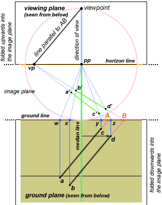
constructing two parallel lines with the visual ray "end points" method
parallel line from viewpoint is used to find the vanishing point; intersections with ground line are used to define image lines from vanishing point and to construct orthogonals that locate the end points (a' to d')
The lines ab and cd are not parallel to the image plane, so they must define an intersection and vanishing point on the image plane (rule 4).
To find the ground line intersections, we extend the lines toward the image plane until they intersect the ground line, creating the two intersection points (orange), A and B.
To find the vanishing point, we construct a line from the viewpoint that is parallel to ac and bd. Because a visual ray is its own vanishing point (rule 1), and all parallel lines converge to the same vanishing point (rule 6), the intersection of this visual ray with the horizon line defines the vanishing point for ac and bd. We then connect the vanishing point vp to the intersection points A and B to produce two extended image lines.
How do we find the endpoints of the two line segments? As before, we could just draw the visual rays from the endpoints of each line to the viewpoint: the intersection of these rays with the corresponding line images we just constructed would define the endpoints in the image (a', b', c' and d'). However, this method becomes impractical when the object is located very far from the ground line or very far to one side of the median line: we'd need a huge ground plan to locate it.
Instead, we use the ground line as a ruler. If we know how far the point we want to find is to the left or right of the median line (arrow to point d), we can simply measure this distance directly at the ground line. This is equivalent to extending an orthogonal on the ground plan from point d to the ground line. Using either method defines the measure points w, x, y and z.
As all orthogonals are parallel to the direction of view, the principal point is their vanishing point (rule 7). So we connect the ground line measure points to their vanishing point to construct four measure lines (which are always image orthogonals in central perspective) that extend the ground line measure points (distances from the median line) into perspective space. Then the line segment endpoints (a', b', c' and d') are located at the intersections of these measure lines with the extended line images drawn before. Thus, the triangle Awa' is the perspective image of the triangle Awa in the ground plan.
The visual ray method has been applied in three different ways: (1) to define recession in perspective space (a metric grid), (2) to locate the vanishing points for the sides of a plan, and (3) to construct line images based on a vanishing point, a ground line intersection, and orthogonals from ground line measure points. All three methods show the fundamental importance of a vanishing point and ground line distances (from the median line to the intersection or measure points) in constructing perspective images.
Importantly, the ground line is always the "actual size" ruler of object dimensions on the ground plane and all planes parallel to it, that are measured perpendicular to median line. If point d is shifted one mile to the side of the median line in physical space, then its measure point is located one mile to the side of the median line along the perspective drawing ground line.
Obviously the crucial step is still missing: how do we work with objects that are very far from the median line and/or ground line? These create ground line measure points and/or intersection points that cannot conveniently be located on the perspective drawing ground line. This challenge requires the artist to reduce the scale of the ground line ruler as a substitute for working with unreasonably large dimensions in actual size. This reduced ruler is called a measure bar, and its use is explained below.
one point perspective
In central perspective or one point perspective there is only one vanishing point (vp), which is located straight in front of the viewer at the principal point — the vanishing point for the direction of view.
Defining Features of Central Perspective. The characteristics of central perspective can be displayed by placing a cube in the center of the circle of view with its sides in the standard central perspective orientation: either parallel or perpendicular to the image plane and direction of view. We additionally (and optionally) orient the cube so that its sides are parallel or perpendicular to the ground plane. In this view the cube is not tilted or turned in any direction.
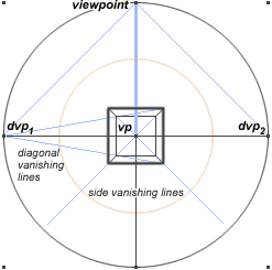
basic geometry of one point or central perspective
There is one vanishing point, defined by the direction of view. Its location is identified by the bold blue line extending from the viewpoint, as explained above. There are two diagonal vanishing points (dvp), sometimes called distance points, at the intersections of the horizon line and the 90° circle of view. There are two vertical dvp's (not labeled) where the median line intersects the circle of view. All diagonal vanishing lines (shown as the two blue lines extending at 45° from the viewpoint) end at these diagonal vanishing points.
Because of the parallel alignment of the form to the image plane and direction of view, some art texts refer to this setup as parallel perspective. This is incorrect: as explained later, all types of parallel perspective, including the elevation and plan, are constructed with lines that are actually parallel to each other, rather than lines that converge to a vanishing point.
Each perspective type is determined solely by the orientation of objects to the direction of view, not by the direction of view itself. However, the direction of view does have its own vanishing point and its own recession toward that point. Central perspective is unique in that the lines of recession defined by objects coincide exactly with the lines of recession defined by the direction of view: two separate recession geometries are laid one over the other. This produces the most powerful illusion of depth possible in a perspective construction.
orthogonals & central recession
The unifying framework for this central perspective recession is formed by the orthogonals, which are any lines ending at the principal point. A pair of orthogonals defines a constant interval of visual width (height, diameter, or distance parallel to the image plane) across any perspective distance. Two orthogonals automatically scale this dimension across all depth locations in the image.
To illustrate, consider a single vertical dimension, the unit dimension, drawn at any arbitrary location on the image plane.
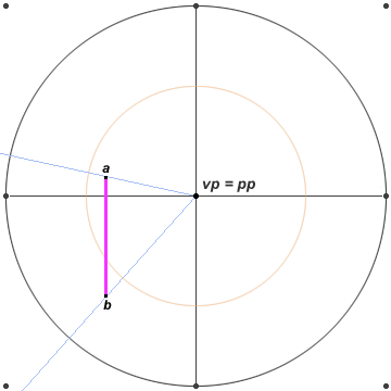
orthogonals from an arbitrary unit dimension
By constructing two orthogonals from the endpoints a and b of the unit dimension back to the principal point (pp, the vanishing point vp for the orthogonals per rule 7), the orthogonals scale the dimension image to any distance in front of or behind the unit line. They project a constant dimension forward or backward in perspective space — they show the visual width of an object at any point in space. (In traditional texts, a pair of orthogonals is called a vanishing scale.)
Any line drawn on the image plane parallel to the original unit dimension, and ending at the two orthogonals, defines the same dimension at other locations in perspective space. The green lines (below) are all assuredly the same height in physical space (assuming they are standing on the ground plane), because their images are bounded by the same two orthogonals.
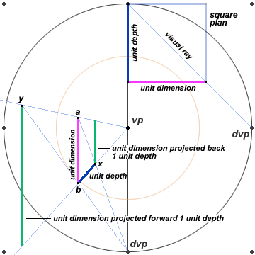
projecting the arbitrary dimension in depth
Diagonals and the Unit Depth. But where in space are the lines located, exactly? We lack a measure of perspective depth — a unit dimension for the physical distance of the object's location that corresponds to the unit dimension of visual width or height we have just constructed.
This problem is solved by projecting the unit dimension into perspective space, so that it no longer represents a height or width dimension parallel to the image plane, but a depth dimension toward or away from the image plane.
The logic of this method is based on the square diagonal. Using a square plan means that the width and depth dimensions are defined as equal, e.g. the ratio of width to depth is 1:1. As the Renaissance artists quickly realized, the square is the fundamental geometry for controlling perspective depth, and is essential to the perspective construction of complex forms.
The circle of view method for finding the diagonal vanishing points confirms that the dvp's — of the direction of view or the viewer's central recession — are always located on the 90° circle of view. Therefore, a line drawn from either unit dimension endpoint (a or b, diagram above) to its opposite dvp (so that the diagonal vanishing line crosses the opposite orthogonal) intersects the orthogonal at a point x which defines a line segment bx that is equal in length to the unit dimension ab. But now it is the unit depth, the image of the unit dimension measured in physical space along a line perpendicular to the image plane. (This procedure is in part why the diagonal vanishing points are traditionally called distance points: they can be used to define units of perspective depth or distance from the viewer.)
Using vanishing lines from the dvp, we can either project the image of the unit dimension backward in perspective space (to x) or forward (to y). This allows us to find the horizontal or vertical dimensions of objects at unit depth in front of or behind the location in perspective space defined by the original unit dimension (at b).
Because the unit dimension, orthogonal line and diagonal vanishing line define a triangle, and a triangle defines a plane, the plane's vanishing line defines the diagonal vanishing points at its intersection with the circle of view. This vanishing line is the median line for vertical dimensions and the horizon line for horizontal dimensions. If the unit dimension is rotated, its diagonal vanishing points are defined by the vanishing line through the principal point that is parallel to the unit dimension.
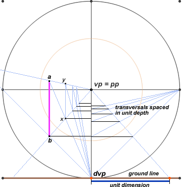
constructing equally spaced transversals or verticals in perspective space
(left) projecting a vertical dimension ab into perspective space, using the bottom dvp; (right) projecting an arbitrary unit width into perspective space, using a side dvp
Now we have a mechanical procedure to construct a "depth ruler" that defines equal units of perspective depth (diagram, above):
1. Define the unit dimension, either as an arbitrary or scaled line segment ab in the image plane (above left), or as a ground line "actual size" length (above right), and draw the orthogonals from its end points to the principal point (vp).
2. Connect one end point to the opposite diagonal vanishing point (dvp) in the vanishing line of the parallel median or horizon line, to define the intersection x with the opposite orthogonal.
3. Construct a vertical line from x to the opposite orthogonal to define the matching intersection y.
4. Connect point y to the dvp as before.
5. Repeat steps 3 and 4, as necessary, to construct more transversals deeper into perspective space.
The spacing is reversible: for a vertical depth scale, transversals from the base of all vertical line segments (e.g., b, x and all similar points) creates a horizontal depth scale.
In the diagram (above), the diagonal ray from dvp through b does not intersect the upper orthogonal within the circle of view. Because the lower (ground) orthogonal intersects the ground line within the square formed by the circle of view, we know the transversal in front of b is closer to the viewer than the image plane.
Unequal Spacing in Depth. Among the most important reasons for projecting unit dimensions is the measurement of unequal intervals in depth. For example, suppose you want to project in depth the unequal proportions in a building facade or unequal spacings among a group of trees. You simply use a measure bar with these unequal intervals marked on it.
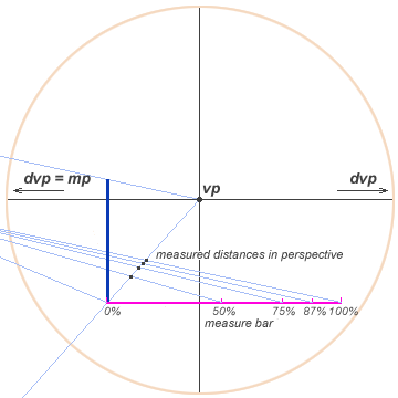
measure bar for unequal distances in depth
shown in a 60° circle of view; dvp's lie on the 90° circle of view
Diagonal lines from each point to the mp transfer these measures into perspective depth at the points where the lines intersect the vanishing line. Draw new verticals at each point up to the other vanishing line.
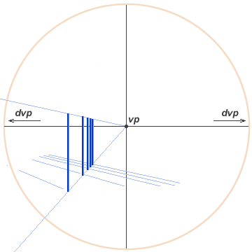
constructed drawing of unequally spaced verticals
shown in a 60° circle of view; dvp's lie on the 90° circle of view
If these intervals are repeated in depth, the solution is simple. Rule a horizontal line across the horizontal vanishing lines at the point where the front edge of the form is located in depth, then use horizontal vanishing lines (to vp) to project the measure bar into space, as shown above. Recreate the measure lines (to dvp) from there, and draw the new verticals up to the other vertical vanishing line.
You can, of course, use the measure bar in a vertical orientation to define distances projected into space. Just connect these bars to measure points (dvp) at the top or bottom of the circle of view, not those at the side.
Shifting the Unit Dimension. Finally, as explained on the previous page, shift foreshortening has no effect on a two dimensional perspective image parallel to the image plane: so it has no effect on a one dimensional unit length parallel to the image plane.
We may freely move the unit dimension anywhere we need it on the image plane, or rotate it to define a unit length horizontally or at any diagonal angle, with the understanding that in its new location or orientation, it defines the unit dimension at the same perspective depth from the image plane. If we require the unit dimension at a different perspective depth, we must use the orthogonals to project it backward or forward in perspective space, either before or after we make the shift.
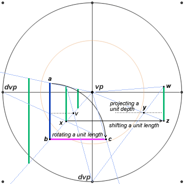
moving a unit dimension to other locations in perspective space
In the diagram, rotating the unit dimension ab so that it is horizontal, as bc, defines the same dimension in physical space. Shifting the farther unit dimension at x to a new location at z defines the same unit dimension at that perspective distance.
Unit depth dimensions may not be shifted or rotated, because the amount of foreshortening depends on the distance of the unit dimension from the principal point. Thus, although the line segments zy and xv are images of the same unit depth, the image lines themselves are not of equal length: xv, because it is closer to the principal point, experiences a greater amount of foreshortening.
slanting & sloping planes
Because all objects are viewed frontally in central perspective, the vanishing point and level orientation for objects and the direction of view are the same. But this is not true in situations where a plane is slanting left to right across the field of view, or sloping up or down along the direction of view. The final problem is to show these surfaces in central perspective as well.
Slanting Planes. For surfaces that are slanting sideways across the circle of view, the solution is to rotate the circle of view around the principal point (just as we'd turn a steering wheel) to create the required orientation.
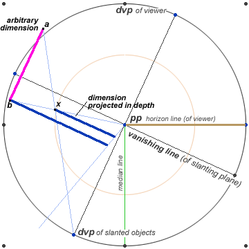
a slanting plane in central perspective
This new plane might be a sloping roof, or the banked curve of a NASCAR racing track, or a receding bank of gentle hillside. In each case the receding surface can be described by a plane that is not the ground plane. Because the tilted plane is parallel to the direction of view, its vanishing line still passes through the principal point (rule 15).
The essential step is to draw a new horizontal vanishing line through the principal point (pp), with the same side to side slope as the physical surface. Then draw a new median line through pp perpendicular to this vanishing line.
Where these lines intersect the 90° circle of view they define four new diagonal vanishing points (dvp), and these can be used to project unit dimensions parallel or perpendicular to the slanting plane into perspective depth.
All unit dimensions or orthogonals can be freely placed and freely shifted, as before, and the procedures for constructing transversals still apply.
Sloping Planes. The more difficult problem is a surface sloping upwards or downwards in relation to the direction of view. The classic example is a staircase rising before us.
The staircase can be simplified as two parallel planes, which represent all the front edges or all the back edges of the steps. The flat surfaces of the steps are formed by a stack of equally spaced, parallel planes in central perspective, cut front and back by the sloping parallel planes. Thus, the object we want to represent (the staircase) is in central perspective because all its surfaces are either parallel or perpendicular to the image plane. What is missing is the sloping limit of its defining edges.
Because the two sloping planes are parallel, both will converge to the same vanishing line (rule 14). But because the planes are not parallel to the direction of view, their vanishing line will not intersect the principal point: it will lie some distance above it.
The solution is straightforward. We need to know the slope of the staircase, which is determined by the depth of each step and the height of each riser. These create two sides of a right triangle, whose hypoteneuse is parallel to the sloping planes. In the example, we want something grand, so the steps are 25" deep and the risers 7.5" high.
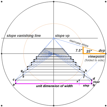
sloping planes in central perspective: the staircase problem
The visual ray method permits us to fold the viewpoint into the image plane — except that we fold it to one side so that it coincides with a horizontal diagonal vanishing point. In this orientation the slope of a visual ray above or below the direction of view is equal to its angle above or below the horizon line. We find this angle by placing an elevation drawing of a single step so that the tip of the hypoteneuse is on the viewpoint and its flat surface is on the horizon line. Then a line from the viewpoint extending this hypoteneuse intersects the median line at a vanishing point in the vanishing line of the sloping planes. This is the slope vp, and we draw the slope vanishing line through it, parallel to the horizon line.
The next step is to scale and position the drawing, which means constructing a unit dimension ab (magenta) that indicates the location of the base of the first step, the apparent width of the staircase at its bottom step, and the scale of the riser (height of the first step above the ground plane) at each side (ac and bd). A line across the top (cd) creates the perspective image of the first riser.
From this point it is simply a matter of plotting the significant points. The key is to remember what goes where:
• The risers are parallel to the image plane, so they have no vanishing point; their sides are defined by parallel vertical lines, the front and back edges of the steps by parallel horizontal lines.
• The steps are horizontal and perpendicular to the image plane, so the vanishing point for their side edges is the principal point (rule 15) regardless of their height in relation to the viewpoint.
• The vanishing point for the recession of separate steps and the width of the staircase in perspective (assuming the staircase is an equal width from bottom to top) is the slope vp, which also controls the location of the front and back edges of each step.
Starting at the base, we construct two lines from the ends of the unit dimension (a and b) to the slope vp, and a matching pair of lines from the riser (c and d). The side edges of the steps are then defined by orthogonals from c and d to the principal point. These intersect the lower slope line at e and f, which locates the bottom edge of the riser. Vertical lines from these points define the sides of the riser, which intersect the upper slope line at g and h ... and the drawing continues by repeating these steps until the top of the staircase has been constructed.
As a check, a line from the dvp through f should intersect the front step edge at x, where xd is equal in length (along the unit dimension and as a proportion of the riser) to the depth of each step.
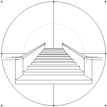
finished staircase drawing
As the steps recede their image spacing becomes smaller and smaller, until they may become so small that the method of constructing lines to the vanishing points may become inaccurate. In that case they can be drawn as horizontal lines spaced by eye or using a ruler.
The side bannister of the staircase can be added after the more complicated step construction is complete and all guidelines have been erased from the drawing.
perspective gradients
The problems of drawing unit transversals and a receding staircase have produced drawings with line spacings that become smaller with distance. This effect of linear perspective appears powerfully in the perception of textures. As textures are usually too small to have vanishing points of their own, their appearance is controlled by the powerful central convergence around the principal point. This is the perspective we always see no matter which direction we look.
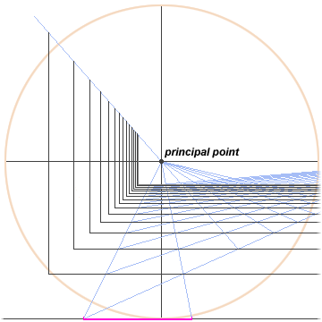
a perspective gradient
shown in a 60° circle of view; dvp's lie on the 90° circle of view
If we extend any series of regularly spaced lines or small objects until they cover most of the circle of view, we have constructed a perspective gradient. This is the texture of all objects and surfaces in space, even when they do not define specific geometrical forms. The necessary emergence of perspective gradients from the regular spacing of objects in depth is demonstrated by adding parallel orthogonals and diagonals (in blue) converging toward the principal point and diagonal vanishing point.
A perspective gradient has a distinctive appearance, regardless of context (diagram, right). We look downward or into a surface texture when it is at our feet, but view surfaces from the side when we look into the distance. Three visual constants result.
First is foreshortening: object dimensions are compressed along the direction of view — the floor tile that appears square under our feet looks like a thin rectangle in the distance; The apparent depth of texture elements — the front to back size of floor tiles, for example — decreases more quickly than the apparent width (the decrease in size due to distance alone).
Second, texture elements parallel to the direction of view are visible at greater distances: at the point where the spaces between the black lines disappear, the blue orthogonals are still widely separated. As we travel in a car or train past a vegetable field, the rows of plants are much more visible than their spacing in depth; the horizontal seams in a brick wall are visible after the vertical seams disappear.
Third, we tend to underestimate the distance of objects or landforms in the middle to far distance, especially if the true horizon is not visible. In contrast, visual angles to the left or right of the direction of view make our perception of direction quite accurate.
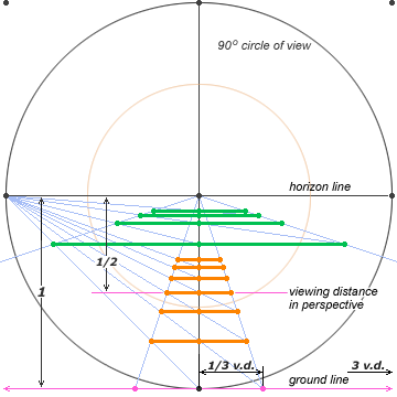
perspective gradient and dominant interval
perspective gradient intervals spaced at 3x viewing distance (green) or 1/3 viewing distance (orange); half the horizon height on the image plane equals double the perspective depth
As this figure shows, the apparent slant or "steepness" of the gradient is due primarily to the proportional relationship between the viewing distance (to the image plane) and the primary texture or basic intervals on the surface being viewed. As these intervals grow larger in relation to the viewing distance, we seem to take a more slanted view of the surface, and there is a more rapid recession of the texture. This is why a plain lawn looks "steeper" or more expansive than a complexly textured wildflower meadow, and why the widely spaced columns of a Gothic church apparently define a steeper gradient than the tile pavement under foot.
A very useful constant in perspective space, regardless of the viewing distance (radius of the circle of view), is that half the horizon height is always twice the viewing distance in perspective depth, where distance is measured along the direction of view from the ground line. In the figure above, if we take the ground line as the distance to the vertical image plane (1.5 meters along the direction of view), then the third orange bar from the bottom is 1.5 meters in perspective depth (each bar represents 1/2 meter).
Perspective gradients are based on a general perspective rule, described below: the size of an image, including the size of the image area between an object and the horizon line, is inversely proportional to its distance from the viewer. In this sense, perspective gradients, whether steeply or gently spaced, are the raw material from which all visual images are constructed.
Eventually textures dissolve into colors with distance. You cannot keep drawing thinner and thinner gradient lines all the way back to the horizon; at some point you must change from drawing lines to painting a gray color that is the average value of the imperceptible lines and the imperceptible white spaces between them. If you want to see how the surface under your feet will appear at a distance, you must put your head near the ground and view it from the side. Close by, the color of a long brick facade combines the surface of the red bricks and the white mortar between them; at a distance, only the surface of the bricks is visible, and the apparent surface color darkens. Typically ground color also darkens with distance (and the ocean darkens near the horizon) because textures scatter much less light parallel to their surface (along that slanting view) than they do back toward the light source.
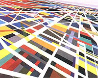
perspective gradient in abstract art
Torben Giehler's "Circling Overland" (2002)
Finally, forms dissolve into textures with distance. Rendering this transition gracefully is one of the higher skills in perspective drawing. The essence is to simplify by extracting the essentials at each perspective step. Draw the foreground house with a detailed brick facade, then a sketchy brick texture for the house behind it; draw the farther houses with only schematic doors and windows, and the farthest houses in outline only. The artist gets a head start by not putting too much detail in the foreground, and designing forms that are easy to simplify: then the transition to less detail can be managed gracefully.
distance & size
Know that a painted thing can never appear truthful where there is not a definite distance for seeing it.
—Leon Battista Alberti [1425]
The discussion of unit dimensions, equally spaced transversals and perspective gradients has touched on the issue of spatial distance and perspective scale. The circle of view framework provides complete control of the relationship between the distance from the viewpoint of physical objects and the image plane, and the effect this has on the apparent size of the physical objects and their perspective images.
The Geometric Elements. The leverage on these problems comes from the principle of triangular proportionality, the geometry at the heart of all perspective and optical images:
Given two triangles of unequal size, if the three interior angles of one triangle are equal to the three interior angles of the other, then the length of all three sides of the smaller triangle will be in a constant proportion to the length of the corresponding sides of the larger triangle.
The proof appears in Euclid's Elements, Book 6, Proposition 2; and the the optical implications were developed in Euclid's Optics, written c.300 CE.
Let's start with distance. Given the perspective setup and the fixed proportions of the circle of view framework, a physical point located beyond the image plane will create an image point at a specific location on the image plane. But where exactly?
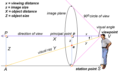
distance and constant triangular proportions
the three interior angles of triangles XYZ and xyz are the same, so each side of the smaller triangle makes the same ratio with the matching side of the larger: x/X = y/Y = z/Z
We first have the visual ray PV defined by the direction of view; this intersects the image plane at point p, the principal point, and is perpendicular to the image plane (as indicated by the small square). The viewing distance between the viewpoint and the image plane (the line segment pV) is the viewing distance (x).
We then choose any point A in physical space (in this example located on the median line), which creates the visual ray AV to the viewpoint V, and the point a where this ray intersects the image plane. This is the image of visual ray AV in perspective space (rule 1). We want to know the image size (z), which is the length of the line segment pa on the image plane.
The point A is at some distance from the viewpoint in physical space, and this distance is measured either along the median line (from point A to the station point S), or along the direction of view (from the point P perpendicular to A to the viewpoint); this is the object distance (X) measured from the viewpoint. And finally point A is displaced from the direction of view by distance PA in physical space. I call this the object size (Z), although it may also be the space between two objects, or the dimension of a group of objects, or any arbitrary unit of measurement in physical space.
We have created two right triangles, the triangle Vap to the image plane, whose sides are of lengths x, y and z; and the triangle VAP to the point in physical space, whose matching sides are of lengths X, Y and Z.
Because the two triangles share a common point (V) defined by the same two lines (the visual rays PV and AV), the interior angles PVA and pVa (at 1) are the same. The two angles apV and APV are also equal (they are both 90° or right angles), so by subtraction the remaining angle must be equal as well.
All three angles within triangle Vap are equal to the three angles in triangle VAP, so the triangular proportionality holds. This means there is also a constant ratio or proportionality between the lengths of the matching sides of the two triangles:
x/X = y/Y = z/Z.
However, we are rarely interested in the line of sight distances defined by the diagonals (y or Y), so these constant ratios are best summarized as:
(1) z/x = Z/X, or
![]()
If Z (object size) represents the radius of the 90° circle of view (or generally, the image distance between the ground line and the horizon line), then this formula is the basis of all perspective gradients: multiply the object distance by X, and the image size is reduced by 1/X.
Key Triangular Proportions. Let's put this key formula into more practical forms. Thanks to the circle of view framework, we already know or can arbitrarily define x (the viewing distance, for example 1.6 meters). Then, if we can specify the object distance X (either arbitrarily or by measuring it in physical space), we can solve the ratio x/X and with this derive the image size z from the known object size Z:
(2) image size (z) = Z*(x/X).
Conversely, if we don't know the actual distance of an object shown in a perspective drawing, but we know its image size z, its actual size Z and the viewing distance x used to construct the perspective view, then the object distance X is:
(3) object distance (X) = x*(Z/z).
Finally, we can determine the viewing distance; this formula is helpful when the artist wants to discover the effects of varying the image size when our distance to the object is fixed (for example, by a constrained choice of viewing locations):
(4) viewing distance (x) = z*(X/Z).
It is also sometimes useful to determine the image scale, the relationship between a unit of measurement on the image plane (painting surface), and the units of measurement that describe the object's size:
(5) image scale = (z/Z).
This formula is used to determine the appropriate scale for measure bars in perspective space. However, note that the drawing scale in a perspective drawing is dependent on the object distance, unlike the scale used in street maps, elevations or plans where all objects are flattened by parallel projection into the image plane and therefore are represented at the same scale.
The crucial assumption when using the triangular proportions is that the measurements of both object size Z and image size z are perpendicular to the direction of view or (equivalently) parallel to the image plane. When this is not the case the image size is altered by foreshortening.
The table (below) presents illustrative measurements for the display geometry of three objects: a contemporary single story home (20' from ground to roofline) to represent architecture or landscape, a man of average height (5'9") to represent figures, and a basketball (9.5") to represent still life objects, as they would be drawn in paintings viewed from a fixed distance of 1.6 meters (63").
|
||||||||||||||||||||||||||||||||||||||||||||||||||||||||||||||||||||||||||||||||||||||||
These figures provide an overview of the effects of distance on image size. You should be able to derive the same figures for yourself, using the formulas given above.
Circle of View Formulas. Linear perspective is based on methods of construction, not calculation. However, the trigonometric basis for the circle of view may be useful. If you know the distance of an object and its physical dimensions measured parallel to the image plane, and you have a calculator with the arctangent function, then the object's visual angle or angular size when the object is centered on the direction of view is:
![]()
The term angular size is used when the visual angle describes a single object — that is, the circle of view that will just enclose it. Thus the visual angle subtended by a standing man 1.6 meters tall viewed from 50 meters is:

Conversely, if you want to know how far away an object must be in order to fit within a visual angle (circle of view) of a certain width in degrees (CoV°) on the image plane:
![]()
For the standing man 1.6 meters tall to fit into a 36° visual angle (circle of view):
![]()
The table (right) gives illustrative values for the visual angle and image scale resulting from various object distance/object size (X/Z) ratios. (The image scale, applied to the object size, gives the image size.)
When using formulas (6) or (7) in situations where the object size is not measured parallel to the image plane (that is, the object is viewed at an angle), then you must first identify the angle between the object dimension and the image plane, then apply a cosine correction for foreshortening to the object size. Then continue as before.
scaling the drawing
The orthogonals in central perspective specify the changing image size of an object at different distances in perspective space. But where the forms are located and their apparent size in the image has to be specified by the artist, by scaling the drawing to correspond to a specific object location, object size and object distance in physical space.
To do that we put the triangular proportions to practical use, by choosing an image format and then locating key objects within the image by use of an anchor point and anchor line.
Recession and Format Dimensions. Let's approach the choice of image format with a concrete illustration. The diagram (below) shows the 90° circle of view standardized on a 1.5 meter viewing distance and viewing height.
To measure the central recession, three orthogonals are drawn to the median line (b) and the ground line diagonal points (a and c). These define two unit dimensions, ab and bc, whose "actual size" at the ground line is 1.5 meters.
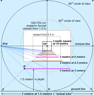
projecting a unit dimension in central perspective
depth is indicated by a ground plane grid of squares 1.5 meters on a side; the emperor paper
format sheet, centered on the principal point, creates
a 102x154 cm "window" into the circle of view
Using the central perspective method for projecting a unit dimension in depth, the diagonal vanishing line from the ground line intersection b to dvp intersects the opposite orthogonal at d, which locates the transversal 1.5 meters beyond the image plane, or 3 meters from the viewpoint (3 meters at 3 meters). Repeating this procedure extends the transversals to a distance of 15 meters, where a 3 meter square is located for scale.
The dotted outline shows the emperor sheet (40x60" or 102x154 cm), among the largest watercolor sheets available, centered on the principal point as a "window" into the perspective space. Anything outside this format cannot be shown within an image it contains — specifically, anything on the ground plane that is closer than 4.5 meters (brown transversal). Thus, even a very large painting format crops out the most exaggerated perspective distortions, which lie outside the 60° circle of view.
The format "window" is always located on the image plane, but it looks out onto a world of objects reduced in size by the viewer's central recession, by an amount that depends on its distance from the viewpoint. So we cannot determine the image scale from the format alone. However, we can determine the reduction in the image area caused by the format "window" in comparison to the round "window" created by the 90° circle of view. This is the format scale:
![]()
A rectangular format has three plausible dimensions — height, width and diagonal (which is how TV and computer screens are measured). The format dimension to rely on is generally the dimension that most constrains the primary form, or the dimension that crops the ground plane. In the example, the ground plane is cropped by the vertical dimension of the format. The half vertical dimension is 51 cm and the viewing distance is 150 cm, so the format scale is 34% (51/150 = 0.34). (Along the 185 cm diagonal it is 62%.)
Stepping back to view the sheet from 255 cm (2.5 times its vertical dimension) reduces it in the 90° circle of view to the smaller dotted outline, where it spans approximately a 30° circle of view and a vertical format scale of 20%. Now the transversals (which still project the viewing distance in depth) represent a unit distance of 255 cm, so the format "window" crops the ground plane at 12.75 meters. Simply by increasing the viewing distance, we have reduced the format scale and cropped out more of the foreground.
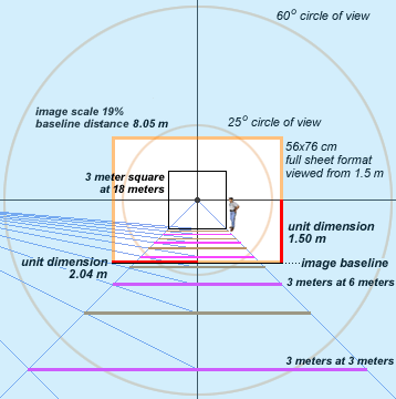
the unit dimension within a smaller circle of view
shown in a 60° circle of view; dvp's lie on the 90° circle of view; the full sheet paper format creates a 56x76 cm "window" into the circle of view
In this second diagram we have returned to the 1.5 meter viewing distance, shown for detail so that the 60° circle of view fills the image. The gradient of 1.5 meter transversals is continued to 18 meters, where the 3 meter square is now located; a human figure stands next to it for scale.
The yellow outline shows the full sheet paper format (22x30" or 56x76 cm) centered on the principal point. This full sheet "window" encompasses approximately a 25° circle of view or a vertical format scale of 18.6%. This view shows a tighter spacing in the foreground transversals because the transversals visible in the image are farther away, and this tighter spacing produces a more homogenous or gradual sense of perspective recession: even moderate distortions in the ground grid have been cropped out.
Now, if we assume that the format is not a window in the image plane but actually a rectangular arch or tunnel opening in perspective space, then its bottom edge would rest on the ground plane, forming a new, "virtual" ground line. This image baseline crops the ground plane at a perspective distance of 8.04 meters (on the image plane, 28 cm below horizon line). Half its width defines a unit dimension in perspective space of 2.04 meters (38 cm on the image plane).
How do we derive these depth measurements? By applying the triangular proportions to the format dimensions and viewing distance, as shown in the diagram, below.
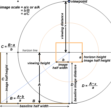
triangular proportions in the image dimensions
The three critical measurements are the horizon height (the distance between the image horizon and the image baseline, 28 cm in the example), the format or image half width (for a full sheet, 38 cm), and the viewing height (distance from viewpoint to station point). Then the baseline half width, image half height, baseline image distance (in perspective space) all follow. (For reference, the format proportions b/a or a/b are listed in the table of watercolor paper formats.)
| object distance (size = 1) |
visual angle | image scale |
| 1/2 | 90° | 170% |
| 1 | 53° | 100% |
| 2 | 28° | 53% |
| 3 | 19° | 36% |
| 4 | 14° | 26% |
| 5 | 11.5° | 22% |
| 6 | 9.5° | 18% |
| 7 | 8.2° | 15% |
| 8 | 7.2° | 14% |
| 9 | 6.4° | 12% |
| 10 | 5.7° | 11% |
| 15 | 3.8° | 7% |
| 20 | 2.9° | 5% |
| 30 | 1.9° | 4% |
| 50 | 1.1° | 2% |
| 100 | 0.6° | 1% |
distance/size ratio with corresponding centered visual angle and image scale
These examples are intended to show the importance of the viewing distance in relation to the format dimensions as a means to crop the central recession to a restricted area around the principal point — that is, to reduce the circle of view. The format size, viewing distance and viewing height do not affect the viewer's recession, the spacing of the transversals or the perspective gradient. They affect how much of this recession is visible in the image, and also the depth spacing attributed to the same perspective gradient (either 1.5 meters or 2.5 meters in the example above). The amount of cropping increases with a smaller image format, a longer viewing distance to the image plane, a greater viewing height, or a horizon line located below the middle of the image format.
Despite these cropping effects, the relationship between viewing distance and horizon height in the perspective gradient remains constant. In particular, the half horizon height rule applies to the perspective depth of the image baseline (diagram, below). The viewer's perspective gradient or central recession remains constant in relation to perspective viewing distance, regardless of image size. The location of the image baseline in perspective space only determines the viewing distance that will be doubled.
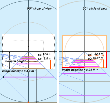
the "half height rule" and image baseline
regardless of image size or horizon height, half the distance from the image baseline to the horzion line equals double the viewing distance in perspective depth
In landscape images, a narrower view around the principal point edits out the extreme foreground distortions at the bottom of the image plane, moderates the amount of distortion visible in objects near the left and right format borders, and controls the visual evidence for flatness, depth or wide angle spatial volume presented by the image.
These issues are less significant in figure, portrait or botanical paintings, where the subject is usually vignetted much closer to the image plane and the viewer's central recession is obscured by a flattened or distant background. Even in these situations, however, drama is produced specifically by the angle of view (downward, level or upward) and the recession in front of and behind the figure; portraits from J.S. Sargent to Lucien Freud provide many provocative examples in the use of perspective depth and viewing angles.
Anchor Line & Anchor Point. The choice of format, viewing distance and horizon height constrain the central recession defined by the viewpoint. But the perspective of principal forms depicted in the image depends on the recession they display. And object recession is a function of image scale and vanishing lines.
So the next step is to determine the location and size of the primary forms. This is done with two references:
• The anchor line is a unit dimension that determines the image size of the primary form, and therefore the actual image scale. Most often this is the front edge of a square, cube or rectangular solid, the diameter of a circle or sphere, or the height of a standing figure.
• The anchor point is a landmark on which the primary form can be constructed. Most often this is the front corner of a square, cube, pyramid or rectangular solid, the center of a circle or sphere, or the standing location of a figure. This point locates the object in relation to the direction of view — left or right, high or low.
There are two alternatives to this basic design step: either start with the format dimensions and work out the placement and image size of primary forms, or start with the arrangement and relative size of primary forms and then choose the best format dimensions to display them. In practice, this means you either (1) outline at a much reduced scale the format proportions you intend to use, then make a freehand perspective sketch of the object and horizon line in the desired size and placement within the format; or you (2) draw the primary form(s) freehand at whatever scale is convenient, then "crop" the image by adding a format outline around it. From this sketch you derive the proportional measurements for the anchor point, anchor line and horizon line from the center point or edge of the actual support.
Either way, you use exclusively artistic or compositional criteria to design the image. For the moment you ignore the perspective problems implied by the sketch, because these are resolved by the construction steps.
Scaling Steps. To motivate this example, assume that we want to build the image around a primary form 209 cm in height. Object size is the only uncontrollable aspect of perspective design: we don't change the size of objects, real or imagined, only our view of them (and, with the choice of viewing distance and format dimensions, our view of the view).
1. Design the image. Using a sketch, locate the primary form(s) within an appropriae or esthetically pleasing format outline (longer for landscapes, taller for portraits).
2. Choose the format dimensions. Scale the height/width proportions of the format outline in the sketch to the desired overall dimensions of the finished image; this gives the format dimensions for the finished work. Display considerations (the size of the room where the image will be displayed and the appropriate viewing distance at that location) and practical format sizes are also factors.
Let's assume the artist has decided the image width should be about 1.4 times the image height. Using the table of paper formats she finds she could use the quarter, elephant, super royal, full or double elephant sheets, or any sheet in the A or B series of metric formats; she decides to use the full sheet. Other dimensions can be produced by trimming sheets or cutting pieces from a roll.
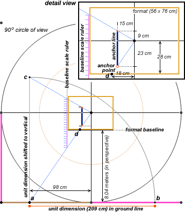
scaling the object size and distance in perspective
based on a 150cm (59") viewing distance (viewing height)
3. Determine the viewing distance and format scale. I explain below my recommendation to make the viewing distance approximately 2.5 times the controlling (form constraining) dimension of the format. This is 140 cm in the full sheet (56 cm*2.5); but for continuity with the previous example I will keep a viewing distance of 150 cm. This crops the viewer's central recession to a 21° circle of view or a format scale of 18.6%. Any form that is located in physical space behind the baseline image distance of about 8 meters and that completely fits within the image dimensions, must be at an image scale of 19% or less. Note that the format scale depends only on the (1) format dimensions and (2) viewing distance.
4. Specify the image size of the primary form. "Look and feel" design considerations and the layout in the preliminary sketch suggest the primary form should have an image height within the full sheet format of 32 cm. This produces an image scale of 32/209 = 15.3%. Because this is less than the format scale of 19%, the object is on the far side of the image baseline.
Using formula 3, we find that this image scale corresponds to an object distance of 9.8 meters (about 32 feet). This is only a judgmental check on the physical distance we are portraying in the image, the sense of intimacy or distance in the image of the primary form, which becomes salient when the physical size of the form is familiar to the viewer (as with portraits or human figures, buildings, most still life objects).
5. Construct the principal point and horizon line. This step determines the location of the format within the circle of view and the horizon height that determines the baseline distance, calculated in the diagram above as (A*x)/a. Implicitly, the horizon line in relation to the format indicates the angle of view in relation to the ground plane: a horizon line above or below the midline of the sheet indicates a downward or upward view into the physical scene. To keep the example simple, I have centered the format on the principal point, which puts the horizon line 28 cm above the lower edge and the median line 38 cm from the side edge.
6. Locate the primary form(s) in relation to the horizon line. This step is crucial. Because objects at the same physical height as the viewpoint (e.g., the camera lens or viewer's eyes) are always intersected by the true horizon, the viewing height is always reflected in the image by the intersection of the horizon line with primary forms.
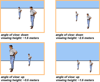
horizon height and intersection with primary forms
location of horizon indicates upward or downward angle of view; intersection of horizon with primary forms indicates viewing height
In the example, the primary form is 209 cm; high, so (assuming both the viewer and the form are standing on the ground plane, and the viewing height is equal to a viewer's "eye height" of 150 cm), the horizon line intersection will be located 150 cm from the base of the primary form. That ratio (150/209 = 0.72) is the proportion of the 32 cm image size that must be located below the horizon line in the image, so its base (the bottom of the anchor line) will be 0.72*32 cm = 23 cm below the horizon line. This is the anchor point or base of the primary form. By subtraction, the top of the anchor line will be 32–23 = 9 cm above the horizon line.
If the primary form is shorter than the viewing height, its top will be below the horizon line by a proportional amount. Thus the anchor point a primary form 120 cm high will be located 150/120 = 1.25 times its image height below the horizon line.
7. Locate the primary form left or right of the median line. The last positioning step is simply to shift the anchor line left or right in the image to locate the primary form within the format.
Because shift foreshortening does not affect perspective image size, the anchor line can be moved anywhere to the left or right within the image; where you choose to place it depends on which part of the primary form the anchor line represents (left edge, right edge, center height), and where you want the primary form located within the image (right, left or centered). Let's assume, based on the sketches and design considerations, that it should be located 15 cm to the left of the median line.
Given the object at an image scale of 15.3%, this 15 cm interval is 15.3% of the physical distance between the object and the median line on the ground plane. So the physical distance is the reciprocal of the image scale times the image size:
object size = (1/image scale)*image size
or, in the example, (1/0.153)*15 = 98 cm.
8. Determine the baseline units. The dimensions and scale of the primary form have been worked out, but it is usually essential to transfer the implied perspective units to the format image baseline. The baseline then can be used as a virtual ground line, and dimensions can be projected in depth using orthogonals from the baseline.
The baseline units are derived from the format scale — which is 19% in the example. This scale is the reduction in a unit dimension along the ground line, as measured on the image baseline. (Rounding is acceptable to make the construction of the scale easier.) An image scale of 19% (0.19) means that 10 cm along the ground line are represented by 1.9 cm along the image baseline.
Starting at the median line, measure left and right in units of 1.9 cm (10*0.19) to create a 10 cm ruler along the baseline. Do the same along one side of the image format (as shown above). Use these rulers to construct the orthogonals necessary to project distances in depth. Assuming you have fixed the image support to a drafting table or watercolor board, it is best to mark out this baseline ruler on a piece of masking tape applied along (but not on) the bottom edge of the sheet. Markings are made on the tape, not on the support, so there is nothing to erase.
9. Locate the diagonal vanishing points. The last step is to locate the diagonal vanishing points in relation to the image format, so that we can project dimensions in depth and construct the vanishing lines to establish the diagonal edges of forms.
These vanishing points are located on the horizon line to the left and right of the principal point, at the viewing distance of 150 cm. These can be established with push pins or dots marked on a piece of masking tape.
10. Construct the anchor elements in the image. We have everything necessary to lay the foundation for the perspective drawing:
• Place the horizon line at the horizon height, then locate the principal point on the horizon line.
• Draw a 32 cm line 15 cm to the left of the principal point (median line), from 9 cm above the horizon line to 23 cm below it.
• Construct the image baseline in 1.9 cm units (image size) = 10 cm (object size).
• Locate the dvp's 150 cm to the left and right of the principal point.
By carefully scaling and locating the primary form within the image, we have established the baseline units necessary to draw the orthogonals and project in depth the transversals necessary to add other objects to the drawing and construct the central perspective view. We have also established the landmarks (horizon height and intersection of the horizon line with primary forms) that signal the viewing height and angle of view onto the physical scene.
display geometry & image impact
The importance of the display geometry has been recognized by painters since the Renaissance, especially in the design of large area frescos, but to my knowledge it has not received a systematic modern discussion. John Ruskin, in his Elements of Perspective (1859), avoids the issue by remarking that "in all points the subject is one of great subtlety and difficulty." However, I have already introduced some of the problems in the section on perspective distortions, and have laid the groundwork in the previous discussions of distance & size and scaling the drawing. This section applies by example the principles developed there.
The Five Key Measurements. The discussion of triangular proportions identified four key measurements in the perspective encounter between a viewer and a painting hung vertically at eye level: (1) the object size, Z, the actual size of the person or thing represented in an image; (2) the image size z, the actual size of the image of the object on the image surface; (3) the viewing distance x, between the viewer and the painting surface; and (4) the object distance X, which is the distance between the viewer and the actual object required to make the actual object appear to the viewer exactly the same size as the image of the object in the painting.
The discussion of scaling the drawing introduced a fifth key measurement: (5) the format dimension S, which is the height or width of the total image surface, whichever is larger.
For convenience, the diagram below summarizes these relationships.
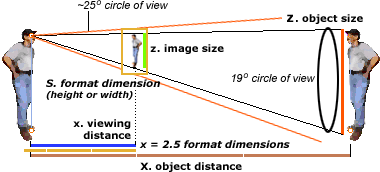
triangular proportions in the display geometry
showing the object size (Z), the image size (z), the object distance (X), the viewing distance (x), and the format dimension (S); as a general rule, x = 2.5*S
Because the object size Z is a physical fact entirely outside the artist's control, the artist usually proceeds by first choosing format dimensions that are convenient for the work — for reasons of economy (smaller image areas require less labor), process (the image dimension limits of a letterpress), or esthetics (larger works have more impact) — then designing the image size z to place the primary form within the format area. This effectively ignores the object distance X as imaginary or irrelevant, and leaves the viewing distance x for the viewer to work out individually, wherever or however the finished image is eventually displayed.
However the underlying creative problem actually creates the need for a balance among three dimensions:
x <—> S <—> z
viewing distance <—> format size <—> image size
so that the apparent object distance X represents a visible solution among these competing constraints.
The result is a specific display geometry. The primary form appears as it would be seen from a specific and virtual (only apparent) physical distance, and this representation is viewed from a situated viewing distance. These factors contribute to the image impact — the esthetic or emotional effect of the image separate from any features of its design or composition.
I propose that the painting encounter can be analyzed as follows:
1. The most important choice — the painting attribute that directly affects all the others — is the artist's selection of the controlling format dimension (S). This is typically the largest dimension of height, width or diameter measured on the image surface, but it can instead be the dimension of the image that crops the object in the image area — the width of the format in portrait orientation, if the portrait crops out the sitter's shoulders, or the height of the image in landscape orientation, if the image crops out objects on the ground plane (1, diagram below).

triangular proportions in the display geometry
2. Hung vertically at eye level, this largest or object cropping format dimension defines a visual width or angular size that becomes visually larger or smaller as the viewer approaches or moves away from it. By adjusting his or her vantage until the format fills a comfortable area of the visual field from a convenient location in the room, the viewer settles on a personal (but often gallery typical) viewing distance (2). For many viewers in many situations, this usually makes the angular size of the painting appear to be about 25° wide, which is equal to a viewing distance around 2.5 times the format dimension. Thus, a painting 4 feet wide is most comfortably viewed from a distance of about 10 feet.
3. The viewing distance fixes the image visual angle (3) or apparent size of the primary form in the image. If the viewer can compare this image size to the actual physical size of the primary form, then the viewer achieves an awareness of a virtual object distance — the distance in real space that would produce an image of the physical object that matches the object's image size in the artwork.
4. Finally, the viewer may use the shape, vanishing lines and central recession visible in the image (especially any perspective gradient in surfaces roughly parallel to the direction of view) to judge the diagonal vanishing point spacing in the image. The viewer implicitly compares this to the dvp spacing in his own (retinal) central recession. These appear to coincide most strongly when the viewpoint is at the center of projection and the image is neither telephoto nor wide angle. Note that this correspondence is completely unrelated to the image size.
5. As a result, the viewing distance and format dimensions determine the format scale or apparent size of the artwork within the viewer's visual field. The viewing distance is fixed, and observable by the viewer as a real distance in real space. The apparent size of the virtual object (its angular size in the visual field), compared to the known actual size of the object in real space (if the object is familiar, or viewed in a recognizable context) creates an implied viewer-object distance. For example, an image on a postcard of the entire span of the Golden Gate Bridge implies that the bridge is very far away (as the photographer was when he made the image).
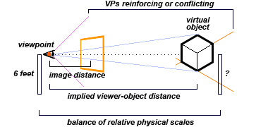
viewer dimensions of the display geometry
This leaves a balance of relative physical sizes to be implicitly worked out by the viewer. The bridge on the postcard does look far away, but it also creates the covert illusion that the viewer is somewhat larger than normal. Alternately, a photograph of a fly enlarged to cover the entire wall of a natural history museum, and because of its size viewed from across a large room, has the effect of making the fly appear huge but also, in partial compensation, making the viewer feel smaller.
The interior cues to the viewing geometry — image visual angle and dvp spacing — compete with the physical format dimensions and the architecture of the display venue in determining the viewer's choice of viewing distance — they can either reinforce or conflict with the balance of relative scales produced by the other dimensions in play.
Thus the viewing distance is an esthetic choice because it is defined by viewer preferences, display conditions, format dimensions and image content, and because it moderates the image impact on the viewer.
Certainly, esthetic choices often take second place to expediency. Most printing formats assume fairly close viewing distances: art book illustrations are normally viewed from a comfortable reading distance (usually less than 2 feet) and, even as wall posters, art images are typically reduced to compensate for display in small domestic spaces. However, the original painting or art object always produces a characteristic esthetic relationship to each viewer through its physical presence and his or her individual preferences, and this is almost entirely lost in any reproduction in any other medium.
Similarly, my experience and review of the visual perception literature suggests that the optimal viewing distance from a painting brings its largest (controlling) dimension just inside a 25° circle of view; at that distance, an encompassing view of the whole work and details of surface, line and brushwork have roughly an equal impact. This implies a viewing distance of about 2.5 times the controlling dimension — that is, the ratio x/S (viewing distance divided by the painting format dimension) is roughly equal to 2.5.
But my observation of viewers in many gallery settings, from an oversold Van Gogh exhibition to a sparsely attended weekday at the Berlin Gemäldegalerie, suggests that the majority of gallery visitors examine a work from much closer in, sometimes in order to read the wall mounted painting titles and annotations, sometimes because of event crowding, nearsightedness or a clinical interest in the painter's technique, but often just because they can — that's where the barrier cable along their shins implies they should stand.
Image Impact. Thus, the actual image impact depends on three viewing factors:
• physical size of the format – to fill a 25° visual angle, a large painting must be viewed from far away and a small painting must be viewed from close by: this is a physical experience within a real architectural space that imparts a physical and spatial sense of grandeur or intimacy to the viewing experience.
• image size vs. actual size – the image object appears to be larger or smaller than the actual object would be if the viewing distance to the actual object were the same as the viewing distance to the image; a discrepancy between the two may have the effect of changing the viewer's subjective size so that she feels unnaturally smaller (if the image is larger than actual size) or larger (if the image is smaller).
• viewpoint vs. center of projection – the shape of objects, vanishing lines and central recession (especially the perspective gradient) in the image determines the correspondence between the image diagonal vanishing points and the 90° visual separation of the viewer's diagonal vanishing points — in other words, the spatial alignment between the viewpoint and center of projection on a line perpendicular to the image plane. A discrepancy between the two produces the sense of a telescopic or wide angle image. (Different convergence effects are produced if the center of projection is above or below the viewpoint.)
The diagram below summarizes the five major variations in these factors.
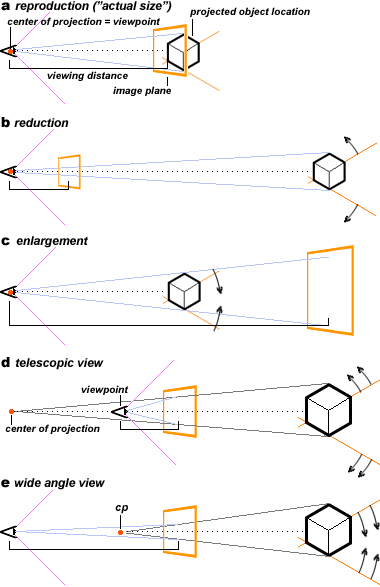
five principal variations of the display geometry
(top) key to symbols in standard central projection set up; a reproduction (actual size or life size); b reduction; c enlargement; d telescopic view; e wide angle view; cp = center of projection
The geometries of extreme enlargement, telescopic view and wide angle view are typical of optical systems (cameras, telescopes, microscopes) or images based directly on them. I do not analyze those image issues here, but a superb general discussion is available in The Camera by Ansel Adams.
These "technical" images are characterized by extreme differences between image and actual size, and/or by large discrepancies between the viewpoint and center of projection. These effects can be amplified or minimized by the format dimensions or image design — "wide angle" effects are less noticeable when the image is cropped to the area close around the optical axis, and "telescopic" effects are less noticeable in images of planes parallel to the image plane, by images of objects governed entirely by one point perspective, or by images of objects that do not occlude (stand in front of) other objects at a large distance behind them.
Three Illustrations. Let's apply these principles to three examples from the western canon, to clarify the implications of reduction, reproduction and enlargement in paintings, drawings and photographs.
Reduction. In Albert Bierstadt's Looking Up the Yosemite Valley (c.1865), the dominant image element (the glorious El Capitan formation) has an image height of 64 cm. This implies a viewing distance of about 1.6 meters from the painting. As the actual rock is about 1000 meters high, a strict perspective solution indicates an object distance of about 2.5 kilometers.
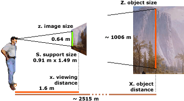
reduction in Bierstadt's
Looking Up the Yosemite Valley
If we take up a map of Yosemite Valley and draw a circle around El Capitan with a radius of 2.5 kilometers (to scale), we discover that the circle passes through the western location known as Valley View (diagram, right).
This is the historically popular vantage for enjoying the valley panorama on first visit and it clearly was the location from which Bierstadt made his painting. It also demonstrates that Bierstadt carefully matched the visual size of the cliff, as seen by the naked eye, to format dimensions that invite the 1.6 meter viewing distance necessary to recreate that image for the viewer. (In academic parlance, he probably used the sight size method of image construction.)
Even though this is a "window view" or accurately sized image for a correctly positioned viewer, the object shows extreme reduction in order to fit the format. A similar reduction appears in late medieval and early Renaissance bust portraits, altar pieces and carved sculpture, in landscape and historical paintings up through modern times, and in most wildlife paintings since the 15th century. (John James Audubon's lifesized wildlife portraits, reproduced in double elephant format, are a stunning exception.) Reduction is consistent with idealization and a nostalgic or lyrical interpretation of the image, as if objects became smaller in memory. It also unifies the representation of atmosphere, character or composition, and subordinates detail to mood.
Reduction also accents the center of projection (or viewpoint): the intended image effect is only recreated at the correct viewing distance. Stepping back 20 meters drastically reduces the apparent size of the El Capitan contained in Bierstadt's painting, but does not affect the apparent size of the actual El Capitan. Baroque Dutch landscape etchings appear dull and dark if viewed from too far away, scratchy and disheveled if viewed from too close; but within about a 25° circle of view they blossom into poetry.
Reproduction. Sandro Botticelli's splendid Birth of Venus (c.1485) as it hangs in the Uffizi (Florence) creates an unforgettable impact the first time you see it, utterly different from any book illustration — wow, it's so big! The dominant image element is Venus herself, who is portrayed at about 145 cm high; this implies a viewing distance of about 3.6 meters with eye level at the background sea level. (At my encounter, this was perversely rather hard to manage in the actual gallery space, as the painting was hung too high and the central vantage was blocked by a display case.)
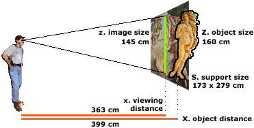
reproduction in Botticelli's Birth of Venus
We can only guess the object size — the stature of the model who posed for Venus, or the typical height of women in renaissance Florence — but women then were shorter than women today, with an average height of perhaps 160 cm. In any case, it is clear that Botticelli is using the strategy of reproduction, creating an essentially life size image in which the object virtual distance equal to the viewing distance. Reproduction is common in Baroque and modern portraiture (both bust and figure), figure nudes in sculpture and painting (Titian's Venus d'Urbino, Rembrandt's Bathsheba at Her Bath and Velàzquez's Rokeby Venus are similarly near reproduction scale) and, in smaller formats, many still life and botanical paintings from the 17th and 18th centuries.
The main impact of reproduction is a sense of presence, a feeling that the object is actually contained in the image or, in the case of Venus, that we are carried into the actual scene portrayed. (The location of the horizon, at Venus's waist, signals that the viewer's eyes must be at the same level, as if her presence has compelled us to kneel or stumble in awe.) This is certainly the intended effect of the grotesquely huge historical or mythological paintings one sees in Europe (for example, in the Paris Musée de l'Armée or the Rubenshuis in Antwerp), and it is characteristic of much commemorative art, from the figure portrait paintings of Rubens to Picasso's Guernica. In many instances the canvases are also physically huge, forcing the viewer back into the gallery space and creating the illusion that a historical moment has mythically erupted into present time.
Because the image is very near life size, changing the viewing distance produces the same effect as changing the object distance. However images at reproduction scale are not indifferent to the viewer's location. Instead, the viewer seeks the center of projection with the same intuitive sense of distance that he or she would use to find a place within the scene; the choice of the best viewing location occurs with a tangible sense of "rightness".
It's my impression that specific esthetic effects are produced when paintings or photographs are close to, but perceptibly different from, object reproduction. A small reduction (the ~10% reduction in Botticelli's Venus or the ~20% reduction in Manet's Olympia and in many figure paintings by Lucian Freud) dilutes or distances the apparent realism somewhat, causing it to merge into fable, nostalgia, idealization or memory. A small enlargement gives the image an exaggerated realism and individuality and emphasizes its physical presence.
Enlargement. Finally, many modern paintings go in for enlargement, as exemplified in Chuck Close's Big Self Portrait (1968). If we take the support as the controlling dimension, then the viewing distance is quite large — 5 to 7 meters. (The dominant image element, the artist's face, implies a viewing distance of 4 meters.) Yet the object (the artist) is implicitly placed at a conversational distance, less than a meter from the viewer. "So near, and yet so far!" The effect is peculiarly unsettling, as we clearly see facial details and flaws that polite social distance serves to disguise. But it also has a miniaturizing effect on the viewer, proportionately a mere fly buzzing around the artist's head.
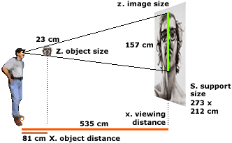
enlargement in Close's Big Self Portrait
This "viewer diminishing" effect of enlargement is desirable in outdoor corporate advertising and propaganda images (which strive to coerce), in modern films (which strive to immerse and arouse), and in commemorative or memorial images (which symbolize superhuman virtues). The irony in Close's portrait is the use of this display geometry for the genre of self portraiture — and a sardonically nonchalant and disheveled portrait at that.
Enlargement minimizes the effects of viewing distance: the image expands into the available space. Enlarged images change aspect less as we move away from them and even seem to pursue us across space; viewed from too close they dissolve into a gibberish of detail. Other uses of enlargement — one thinks of Monet's late lily paintings, abstract expressionist canvases by Jackson Pollock or Morris Louis, the Pop panoramas of James Rosenquist and sculptures of Claus Oldenberg, the spiritualist paintings of Joseph Raffael or Rudolph Stingel — similarly imply modernistic disruptions of space and uproot conventional frames of perception.
Conclusion. The commonplace painting procedure is to choose a support that "seems right" for the allowable time, available tools or intended display impact, then to scale the image size to fit the support. I argue that this procedure is not necessarily wrong, just that it is unconscious and habitual.
Georgia O'Keeffe thought differently about the relationships between the viewer, the object, the format, and the gallery encounter, and produced some stunningly innovative botanical enlargements. Rembrandt utilized the small format imposed by intaglio mechanics to explore the poetics of memory and mood in landscape imagery. These were choices of esthetics, not convenience, and that difference is partly why their works are so memorable.
Artists typically emphasize the "surface strategies" of design and color as the keys to a memorable painting, but I've argued that the display geometry is an equally important ingredient in the image impact. Give some thought to the display geometry — the controlling effect of the physical format dimensions, the correspondence between the image size and the actual object size, and the correspondence between the viewpont and the center of projection — and you'll gain greater control of the image impact.
anamorphic images
Anamorphic images have been distorted so that they appear flat or undistorted (veridical) when they are (a) viewed from a direction that is not perpendicular to the image plane; (b) viewed in a curved mirror or other highly reflective object; or (c) painted on a curved or faceted surface (i.e., the image plane is not a plane).
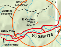
geography of bierstadt's yosemite painting
As a simple example, the ellipse (right) is the anamorphic image of a cross within a circle, if the plane on which the ellipse appears is viewed from above at an angle of about 45° to the computer screen (more, if your screen is tilted). Foreshortening causes the long dimension to appear visually smaller in comparison to the width, compressing the ellipse back to a circular appearance, and centers the cross within the virtual circle.
Anamorphic images become a topic of interest early in the 16th century, as an application of the mathematical and geometrical study of projective geometry beyond the restrictve assumptions of linear perspective (a flat picture plane placed perpendicular to the direction of view). Albrecht Dürer was so detailed in his study of geometrical projections applied to human anatomy and complex curves, published late in his life as the perspective tutorial Instruction How to Measure with Compass and Straight Edge (1525), that he is often cited as the originator of projective geometry. (The basic procedures illustrated by Dürer were systematically developed as descriptive geometry by Gaspard Monge in the 1760's.)
In the artist tradition, the popularity of anamorphic projections peaked in the 17th century, especially as applied in the design of frescoes on the curved interor ceilings of European baroque church domes or naves, so that these images would appear either to be flat or to recede upward as a vision of Heaven. This usage declined sharply by the end of the 18th century. However anamorphic images have been occasionally revived by contemporary artists, though in the less saintly applications of visual puzzles and street chalk drawings.
Geometrical Illustration. The procedures for designing anamorphic images are mathematically complex and vary with the viewing context. I recommend later some software solutions to the problem. Here I outline the basic geometrical (constructive) soloutions to two basic applications: a plane slanted to the direction of view, and a cylindrical reflection.
Consider first the application of an anamorphic image to an image painted or drawn on a sidewalk.
constructing a 1PP cube
To conclude, let's go through the steps necessary to build a cubic or rectangular solid in central perspective.

anamorphic image of a circle
adjust your angle of view from above until the ellipse appears as a circle
The primary form will be the Grande Arche located in the Place de la Défense, Paris (right). The exterior dimensions of this office building form a nearly perfect cube, 110 meters on a side. Perspectivists from around the world come here each year to press their foreheads to the pavement, pray to the spirit of Brunelleschi, and debate the exact street address of the vanishing point.
This section will end up explaining the drawing procedures necessary to construct a cube in one point perspective. But I'll use this exercise to introduce and give examples of the many artistic decisions or practical considerations that go into planning and designing a perspective drawing. You can't handle these decisions with routine geometrical rules — they are matters of drawing function, drawing design, artistic style, display conditions and so forth.
Planning the Perspective Image. In the discussion of display geometry, I explained that good image composition represents a compromise among the dimensions of image size, support size, and viewing distance:
viewing distance <—> support size <—> image size
Depending on circumstances, one of these three constraints is usually more important. But a reasonable procedure is as follows:
1. Specify the support size (image area). The support size (paper format) is the most direct way to define the size of the image and the impact of the work, and it is typically the dimension constrained by the architectural space in which the work will be hung (or created, if it is a wall or ceiling mural). I'll chose the large emperor format in landscape orientation (40" x 60", or 102 cm x 152 cm).
2. Specify the approximate image size of the dominant form. The dominant form is "what the painting is about". This must fit into the support and include an appropriate sense of space around it — to put it in a physical context, a dramatic setting, a decorative background, whatever the composition requires. This is dependent on subject matter and the artist's composition and style. I want the building to show the surrounding sky and neighboring buildings, so its image size should be about 1/2 the support height, or 102 cm/2 = 51 cm.
3. Select an optimal viewing distance to the support. This third step, in combination with the previous two, determines the center of projection, the object distance, the image plane circle of view, and the image visual size. This dimension is sensitive to the room in which the work will be hung, its height on the wall, and so on. The 25° circle of view, as a rule of thumb, suggests a viewing distance of 2.5*102 cm = ~2.5 meters judging from the support dimensions, or 2.5*51cm = ~1.25 meters from the image dimensions. However the building image is proportionately small within the format, so I strike the compromise 150 cm. Therefore:
•the radius of the circle of view is also 150 cm
•the image size is about 51 cm
•the visual angle created by the building image size and viewing distance, according to the distance & size formula 6, is 19°
•the object distance implied by the object size (110 meters), image size and viewing distance, according to the distance and size formula 3, is about 323 meters
•the support diagonal (largest image dimension) is 183 cm; again using formula 5, this means the image spans a 63° circle of view.
These calculations are simply checks on the choices of support size and proportions, image size and viewing distance. If anything seems not quite right, now is the time to make adjustments. Everything here seems fine — because I have already decided that I want lots of space around the dominant form, the "almost wide angle" compass of 63° will be visually and dramatically effective — so I continue.
4. Choose the image point of view. Next the artist will choose the type of perspective (angle of view) toward the object. This is conceptually the same as choosing the physical point of view toward view the actual object. Explicitly it means that you choose between one point, two point or three point perspective; central perspective is the choice here. Now you can specify the exact image size — rotating the object in space will change its apparent width and/or height. (Of course, if you knew at the outset that you want the object to be viewed from an angle, you would use the rotated dimensions as your estimate of the image size in step 2.)
In central perspective the single vanishing point (the principal point) has a very strong effect, a kind of vortex for all the recession in the image. (In Baroque painting, a central vanishing point was often used to symbolize the immanence of God.) Because the Grande Arche is itself a kind of tunnel, the tunnel plus the vortex creates a very powerful effect. This is fine if the dominant form fills the image area (as in the photo, above right), but I want to include the physical context, sky and so forth; and I don't want this building, nice as it is, to symbolize God. So I simply shift it to one side. This gives the building a pleasing perspective shape, creates a dynamic visual imbalance, and allows more of the surrounding urban context into the image. (The point: these are design decisions or artistic decisions: they are not geometrical problems that you solve with cookbook geometrical principles.)
5. Determine the vertical location of the horizon line (in relation to the dominant object and the support dimensions). The horizon line is basically the image of the viewer's height above the ground plane. So the placement of the dominant object's image in relation to the line indicates our height in relation to it. For the Grande Arche, if the horizon line ran through the roof, we'd be viewing the building from a height of 110 meters. If it ran through the foundation, we'd be sitting on the ground. Obviously, we can choose any placement we want, and our artistic choice depends on the size of the object and how we want it displayed.
In central perspective, extreme placements of the horizon line have an exaggerated effect. Even so, I choose to put the line somewhere near the base of the Grande Arche, to give it an upward emphasis: about 1/5th the height of the building from the bottom edge, to give roughly a 21 meter viewing height.
However, it is usually bad composition to divide the image in half with a strong line (such as the horizon line), and putting the horizon line in the middle of the image would push the building comically up against the top of the support. So I simply shift it up. This is an artistic decision; but note that even though this is a drawing in central perspective, the vanishing point does not have to be "central" in the image!
6. Make a perspective sketch. At this point, make a sketch of your perspective solutions — if you haven't already! It's often easier, after step 1, to outline the support in small scale, design the image within this outline, and then work out the actual dimensions from there; or use the support proportions to crop or resize a photograph. Or simply start with a freehand sketch of your concept, crop the sketch to give the most pleasing composition, then use the sketch dimensions to choose your format dimensions.
At this point we shift emphasis from artistic design to drawing procedures. The goal is a sketch that contains all the information shown above, in a format large enough to yield accurate measurements (12" on the long size is usually sufficient). Then it is necessary to locate the anchor line within the drawing area or picture format. This step defines the unit length, height and width of the form we want to draw.
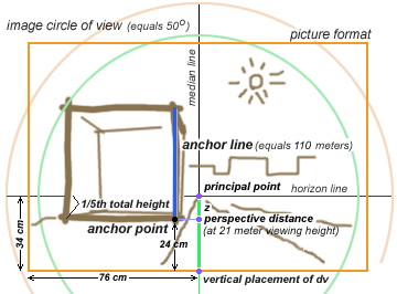
the perspective sketch
shown in a 60° circle of view and emperor format (102 cm x 152 cm) for a 150 cm viewing distance
From the preliminary steps above, we already know that the 110 meter Arche is going to be displayed at an image size of 0.51 meters — the image is at a scale of 0.51:110 or 1:216 (one centimeter equals 2.16 meters). This scale only applies to the Arche and any objects in the drawing at an equal distance (323 meters) from the viewpoint; objects closer or farther away will appear at a different scale. But this is enough for me to establish the scale of the anchor line and measure bar necessary to construct a detailed drawing of the building: 110 meters/2.16 = 51 cm.
Now refine the sketch — cleaning up the drawing, adjusting the size or location of the primary form, enlarging or reducing the format outline — until it looks the way you want it.
Finally, using the location of the principal point and the size of the circle of view, locate the vanishing points and measure points, which in central perspective are the same as the principal point and the diagonal vanishing points. If these points are outside the drawing, estimate their location from the circle of view; choose a work area large enough to fix them physically so that you can use a straight edge (or a length of string or fishing line) to construct perspective lines into the drawing.
6. Make the perspective layout. Now take these measurements from the drawing (as shown above):
• vertical placement of pp, measured from the top or bottom edge of the format. This is usually also the vertical placement of the horizon line, unless your direction of view is into the sky or the ground: 34 cm.
• horizontal placement of pp, measured from the left or or right edge of the format: 76 cm.
• vertical placement of the anchor point, measured from the pp or horizon line. A viewing height of 21 meters is 1/5th the building height, so this dimension is one fifth the image size: 51 * 0.2 = 10 cm below the horizon line (24 cm from the bottom of the support).
• horizontal placement of the anchor point, measured from the pp or median line: I choose 10 cm.
• length of anchor line, measured from the anchor point: 51 cm.
Constructing the Perspective Image. Now you have made all the preliminary decisions regarding the perspective image. You can start the actual perspective construction.
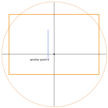
frontal cube: the anchor line
shown in a 60° circle of view; dvp's lie on the 90° circle of view
The first step in central perspective is always to locate the anchor line within the drawing area. This defines the unit length, the height or width of the form we want to draw. The diagram shows a vertical unit length, but a horizontal length is equally good.
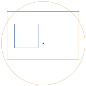
frontal cube: completed front face
shown in a 60° circle of view; dvp's lie on the 90° circle of view
Once we have the unit length, we can draw the front face of the cube or rectangle. We draw all the corner angles at 90° (right angles), because the face of the cube is parallel to the image plane and there is no perspective distortion in the apparent shape. If the form is a square, we can use a ruler and a drafting square, or standard construction methods, to build the front face. If the face is rectangular, we need a ruler to get the vertical and horizontal proportions accurately.
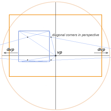
frontal cube: recession and diagonal vanishing lines
shown in a 60° circle of view; dvp's lie on the 90° circle of view
Once we have the front face of the figure, we draw lines from each of the four front corners back to the vanishing point (vp). These lines are parallel to each other in real space, which means they define the four side edges of the cube, which are also parallel. However, there is perspective foreshortening on the length of these edges, so we do not know how far back they should extend.
The face of the cube gives us the dimensions we want: we just connect the front corners to the opposite measure points (dvp). Where these lines cross the vanishing lines defines the corner points of the cube.
If the form is a rectangular solid, the length in depth may not be the same as the length in height or width on the image plane. In this case we use a measure bar to project that length in depth.
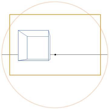
frontal cube: finished drawing
shown in a 60° circle of view; dvp's lie on the 90° circle of view
Once we have the back corners, we can complete the drawing and erase the vanishing lines we had to draw to construct the figure. I've shown the cube as an open box, to reveal some of the back lines.
Correcting Distortion. Unfortunately, as shown below, there is typically something that doesn't look right about a cube in central perspective. The front face is perfectly square, which is a shape it can have only when it is centered on and perpendicular to our direction of view (dv), as shown above. Yet we can see the outer side of the cube, which means our view is oblique to the cube, not head on.
This distortion always arises when we look at a perspective drawing farther away than the correct viewing distance implied by the circle of view. In this illustration, the radius of the circle of view is 4cm on my computer, which means I should view it with one eye 4cm from the central vp. That's not comfortable!
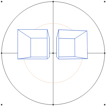
frontal cube: uncorrected (left) and corrected drawings
This is a familiar problem in simple perspective drawings, and it arises because artists commonly overstate the size of the object within the circle of view so that they can show more of its side surfaces and depth. When this problem arises there are three solutions. The first is to keep geometrical forms close to or over the center of the circle of view, with all parts inside a 30° circle of view. (The form appears as if viewed from farther away.) This allows a greater range of viewing distances with less noticeable errors in the perspective facts.
The second solution is to devise the drawing so as to minimize the areas of most obvious distortion. For example, if the cube represents a room in your house, you can crop the view so that the upper left corner is outside the drawing.
Third, you can correct the drawing by hand to make it look better. The correction is simple to do. The worst problem is with the outer corners of the cube, both in front and in back. In real space, we would be looking into these at an oblique angle, which would make a right (90°) angle appear to be greater than 90° — the angle appears to flatten out a little. To imitate this, we just have to move the outside corners inward, straight toward the direction of view, making this shift larger the farther away they are from the dv. Then redraw all the connecting lines to match.
The freehand adjustment is shown at right. It makes the front face into a trapezoid or irregular four sided figure, and makes the front edges no longer parallel.
Basically, you use the central perspective figure as a first draft of your drawing, and by correcting it freehand, using your eye, you've reasserted control of the drawing and made whatever adjustments seem most pleasing for the effect you want to create. Or you may want to introduce distortions into a perfectly accurate perspective drawing for expressive effect. This is the theme that concluded the previous page: don't let perspective tell you what to do if you don't like the esthetic results.
early renaissance methods
It will be instructive to conclude with a description of the perspective techniques used by early Renaissance painters, who worked within a far simpler cenceptual framework. Their methods relied on practical drawing methods, require the physical manipulation of drawing tools and materials, and appear indifferent to (or unaware of) the abstract issues perspective geometry.
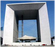
la grande arche de la défense, paris
The Renaissance procedure, first described by Leon Alberti in 1435, was anchored in the construction of a grid of squares in the ground plane of the perspective image. In the earliest paintings, this grid was often explicitly carried into the finished image as an ornamental pavement of contrasting Alberti tiles, as shown in a painting by one of Alberti's contemporaries (image, right).
Alberti's instructions for constructing this grid are easy to follow (figure A, below): (1) define the rectangular limits of the image area (on the canvas, wood panel or wall), (2) insert the image of a standing adult figure at the bottom edge of the rectangle, to represent the appropriate vertical scale of human figures at the very front of the image plane, (3) draw the horizon line at the height of this figure's head, (4) place the centric point on the horizon line at or near the middle of the image area, (5) divide the bottom edge of the image area into equal units of scale (usually as braccia, one third the height of the adult figure inserted at step 2), and (6) connect each of the braccia units along the bottom edge to the centric point to define the converging orthogonals.
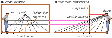
renaissance method for constructing central perspective
from the instructions in Alberti's De pictura (1435)
Lines that define the spacing of the tiles in depth (the transversals) were constructed by duplication the whole setup as a side view (figure B, above). The steps were: (1) at one end of a long horizontal line, draw a standing adult figure that corresponds to the standing figure in the image rectangle, (2) divide the horizontal distance in front of this figure into braccia units proportional to the figure's height, (3) at the desired virtual viewing distance (e.g., the location of the viewpoint within the space depicted in the painting, not necessarily the location of a viewer of the painting or fresco in the real world), draw a vertical line in front of the standing figure to represent the image plane (canvas or wall), (4) connect with lines each of the baseline braccia units to the eye of the standing figure. The vertical spacing of the transversals in the image is shown by the points where the lines converging at the eye of the figure cross the vertical line representing the image plane. Then (5) transfer these vertical spacings back to the wall or canvas (magenta lines) to locate the transversals on the image plane. The accuracy of the construction was confirmed if the diagonal corners of the metric grid all fell on a straight line (the check line, orange in the figure).
The interesting point about Alberti's presentation is that it only describes a basic procedure. We would expect that Alberti's treatise, as a broad introduction to novel artistic methods, would not deal with the refinements of perspective construction. But the paintings by Lippi and others of the time clearly display a variety of artistic choices that are not discussed in Alberti's text. Key among these are the judgments necessary to minimize or hide the perspective distortions that occur when the angular area encompassed by the visual design is too wide or geometrical objects that readily display perspective distortions are excluded from the extreme limits of the image.
To pursue that theme, we can use the orthogonal and diagonal pattern of the tiled floor to locate the central vanishing point and a diagonal vanishing point, and with these construct the 90° circle of view, add foreground transversals and locate the viewpoint implied by the perspective. The eye height of the standing figure at left indicates that each square of the floor represents roughly one fifth an adult male stature, and assuming this is about 30 cm, the reconstructed transversals indicate the image plane is visualized about 5.5 of these units (or about 1.7 meters) in front of the image lower edge and places the virtual viewpoint about the same distance in front of the image plane.
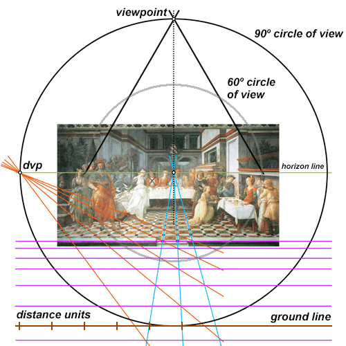
reconstructed central perspective in Lippi's painting
This analysis affords several insights. From the imputed viewpoint the extreme lateral placement of the human figures is enclosed by a 60° field of view. Why a painter chooses a particular location of the image plane or virtual viewing distance is not a problem delved by Alberti, although a 60° field of view was a conventional limit for the human field of view in medieval optics, and this approximately one radian angular width implies that human stature was the measure both for the placement of the image plane and the virtual viewpoint in front of the image plane — a rather literal implementation of the Greek maxim that "man is the measure of all things".
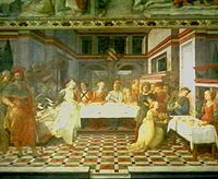
Alberti tiles in the Feast of Herod by Fra Filippo Lippi (c.1430)
This construction reveals several perspective problems omitted from Alberti's account. The first is that bringing the image space down to the ground line produces a gross exaggeration of foreshortening, which requires front limit of the imaged space to be placed a distance behind the image plane; as we've seen, Lippi places the front edge of Herod's floor about one male height behind the image plane. The rectangular table top at right would normally also produce unsightly distortion, but it is turned slightly counterclockwise to approximatly align with the table top with the central vanishing point, essentially creating a paraline projection or pseudoperspective to solve a perspective problem. Additional image depth does not greatly enhance the perspective effect; early Renaissance paintings often represent a relatively shallow, "theatrical" space (like Lippi's painting, above); or they show a central area of perspective regularity carefully limited on both sides by staffage (anonymous human figures); or they fill the background with a flat drape of architectural facades or far distant landscape. Some of these devices are used in Botticelli's nativity image (right), although Botticelli has not cropped the image area vertically enough to hide the unsightly weight of the column capitals, and the receding beams define a central vanishing point that is below the standing height of the figures — possibly to exaggerate the spatial recession in order to amplify the significance of the central figures.
A second point is that Alberti's method of construction produces a rigorous perspective solution without an abstract geometrical rationale.. There is no explanation of the centric point as a vanishing point, no understanding of how to locate the diagonal vanishing points (distance points) before drawing the transversals. Everything is developed step by step from the image format, the scale of a human figure within the image, and the distances between the represented space, the image plane and the viewer. Nor is the virtual viewpoint related in any way to the viewpoint of an actual observer: Lippi's fresco is one of many around the walls of the Prato Cathedral, some of them several meters above the floor but adhering to Alberti's principles. Michelangelo was among the first artists to take into account the architectural relations between fresco and viewer when he slightly enlarged the figures in his Last Jugment because they were far above viewers on the chapel floor.
Finally and perhaps most important, the perspective of individual objects or figures is omitted from the procedure. This is consistent with the lack of an overall geometrical method. Artists could construct the perspective grid that defines the stage and the location on the stage of the actors and props, but they did not explicitly develop the images of objects (other than walls, tables, cornices, stairs and the like) using strict perspective methods. With few exceptions (such as Mantegna, Correggio and Tintoretto), painters throughout the early Renaissance handled figure perspective much more freely (or clumsily) than architectural perspective. Even architectural features could be represented with multiple vanishing points. Sandro Botticelli seems sometimes to have done this for dramatic effect and even emphasized perspective incongruities with strongly foreshortened walls or platforms.
In its early stages, then, the emphasis in linear perspective was on the construction of a spatially convincing representation, not the creation of a genuinely illusory three dimensional space. From the first, Renaissance artists were indifferent to the deceptive peep show possibilities of perspective renderings: Leonardo mentioned them only to dismiss them as impractical. Instead, perspective was utilized to enhance the overall esthetic impact of a visual design, and pseudoperspective solutions were freely utilized to solve specific problems that interfered with this harmonious goal.
In their simplicity of construction and freedom of modification, the Renaissance methods show how much a desire for coherence and consistency, both visual and intellectual, was expressed through skillful and ad hoc adjustments for positive effect. Our modern understanding of perspective is far more rigorous than the early Renaissance approach. Although painting gained thereby a heightened realism and virtuosity, it also lost a uniquely naive and vernacular portrayal of human action in the world.
N E X T : Two Point Perspective

mixed perspective in "Adoration of the Magi" by Sandro Botticelli (c.1500)