How to implement north star layout in css

Design Requirements
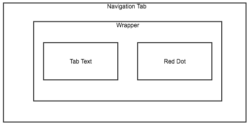
tab text centering in navigation tab, a red dot relatively positioned at the upper right of tab text (text content might vary).
Constraints:
navigation tab has display set as flex, so float, clear and vertical-align will have no effect on children (flex items).
Box model

Solution
- wrap the tab text and red dot inside a
divorspan - set
align-items: centeron the wrapper in preparation for text centering (note: by now the tab text are not center aligned since the red dot taking up some space of the wrapper) - set
position: relativeto override the defaultstaticposition on the wrapper, so that it’s children can position relatively to it (reference: CSS position Property) - set
position: absoluteto the red dot, so that it can position relatively to it’s parent element: the wrapper. And notice, since the red dot has absolute position, it will float out of the document flow, by now the only child of the wrapper will be the tab text, which will take up the whole space. Since the wrapper is centered in navigation tab, so is the text. Since the text is the only child of the wrapper, position relatively to the wrapper has the same effect as position relatively to the text itself. - adjust
topandleftto set the right distance from the wrapper for the red dot.